Шрифты
Добавить комментарий
Читать комментарии
Комментариев
-
#1 Kudos! What a neat way of thiinkng about it. Jun 01 2011
-
#2 What a great rsoercue this text is. Jul 19 2011
-
#3 All of these articles have saved me a lot of headhaces. Jul 29 2011
-
#4 This is way better than a brick & moartr establishment. Aug 04 2011
-
#5 Yeah my font sizes and margins/padding were all over the place beofre. Now there's 2ems around the main content and 1em between everything else. Verdana seems to be a bit easier to read when compared next to Arial. Sep 26 2012
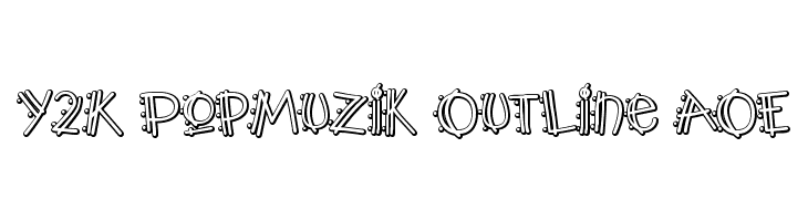
24hourbauer Шрифта
- 24hourbauer.ttf
- Шрифта: 24hourbauer
- вес: Regular
- Версии: Version David Martin V.1.0 June 20 2005 24hourbauer.co.uk
- Количество символов:: 143
- Схема кодировки:
- фиксируется шаг: 0
-
( Fonts by Astigmatic One Eye Typographic Institute - Brian J. Bonislawsky - astigmatic.com )
 Загрузка 301 Загрузки@WebFont
 -
( Fonts by www.vicfieger.com )
Загрузка 4167 Загрузки@WebFont -
( Fonts by weknow - Wino S Kadir )
Загрузка 3711 Загрузки@WebFont -
( Fonts by Nick Curtis - www.nicksfonts.com )
Загрузка 239 Загрузки@WebFont -
Загрузка 2299 Загрузки@WebFont
-
( Fonts by www.fontalicious.com )
Загрузка 438 Загрузки@WebFont -
( Fonts by Daniel Gauthier )
Загрузка 632 Загрузки@WebFont -
( Fonts by Nick Curtis - www.nicksfonts.com )
Загрузка 1376 Загрузки@WebFont


Шрифты Коммерческие
-
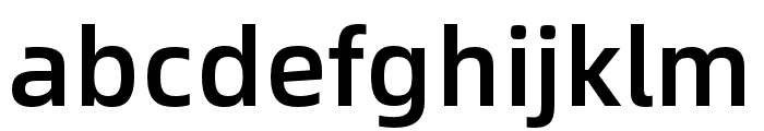
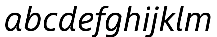
Buy font Alibaba Sans Medium Коммерческие
-
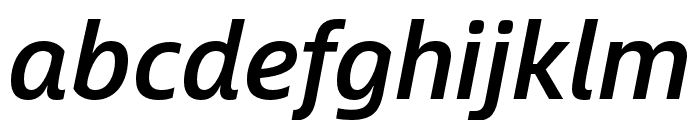
Buy font Alibaba Sans Medium Italic Коммерческие
-
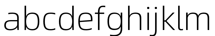
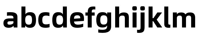
Buy font Alibaba Sans Light Коммерческие
-
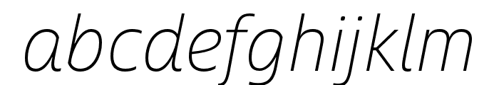
Buy font Alibaba Sans Light Italic Коммерческие
-
Buy font Alibaba Sans Italic Коммерческие
-
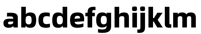
Buy font Alibaba Sans Heavy Коммерческие
-
-
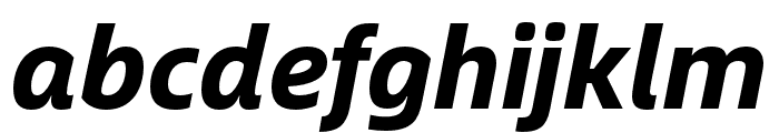
Buy font Alibaba Sans Heavy Italic Коммерческие
-
Buy font Alibaba Sans Bold Коммерческие
-
Buy font Alibaba Sans Bold Italic Коммерческие
-
Buy font Alibaba Sans Black Коммерческие